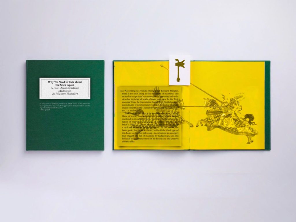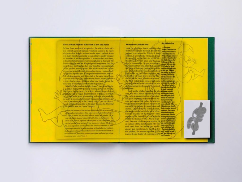
I used a bold yellow background on the inside pages to contrast with the dark green cover and make the content visually striking.
The combination of green and yellow creates a vibrant, almost eclectic visual that symbolises my thinking about the complexity and multi-layered nature of the themes in the book.I chose serif fonts for text, often used in academic or literary works, to enhance readability and convey a sense of formality.
The main text is in a clear and consistent font, ensuring that the reader can focus on the content.
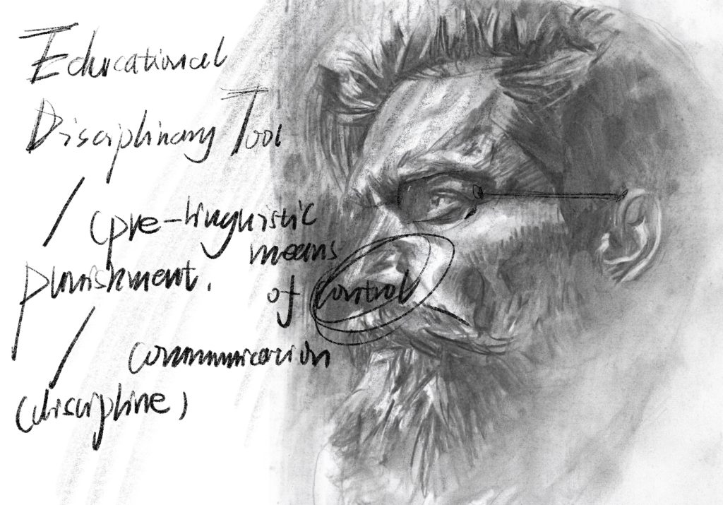
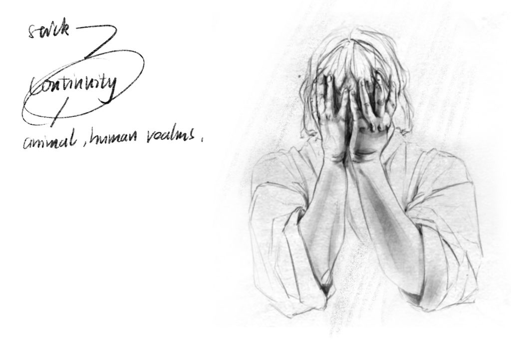
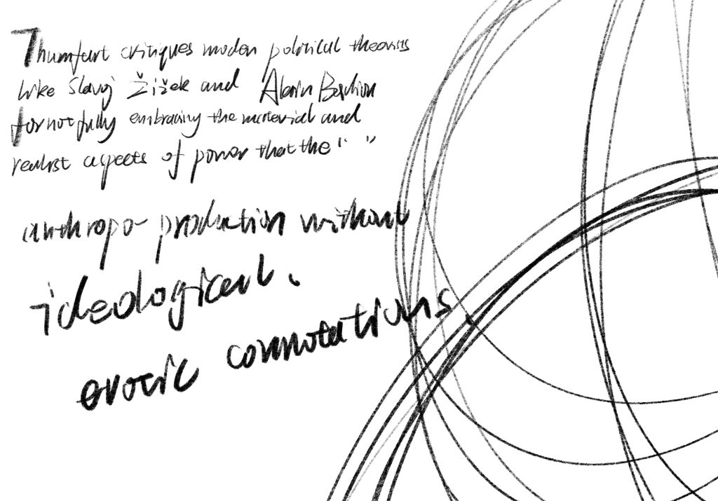
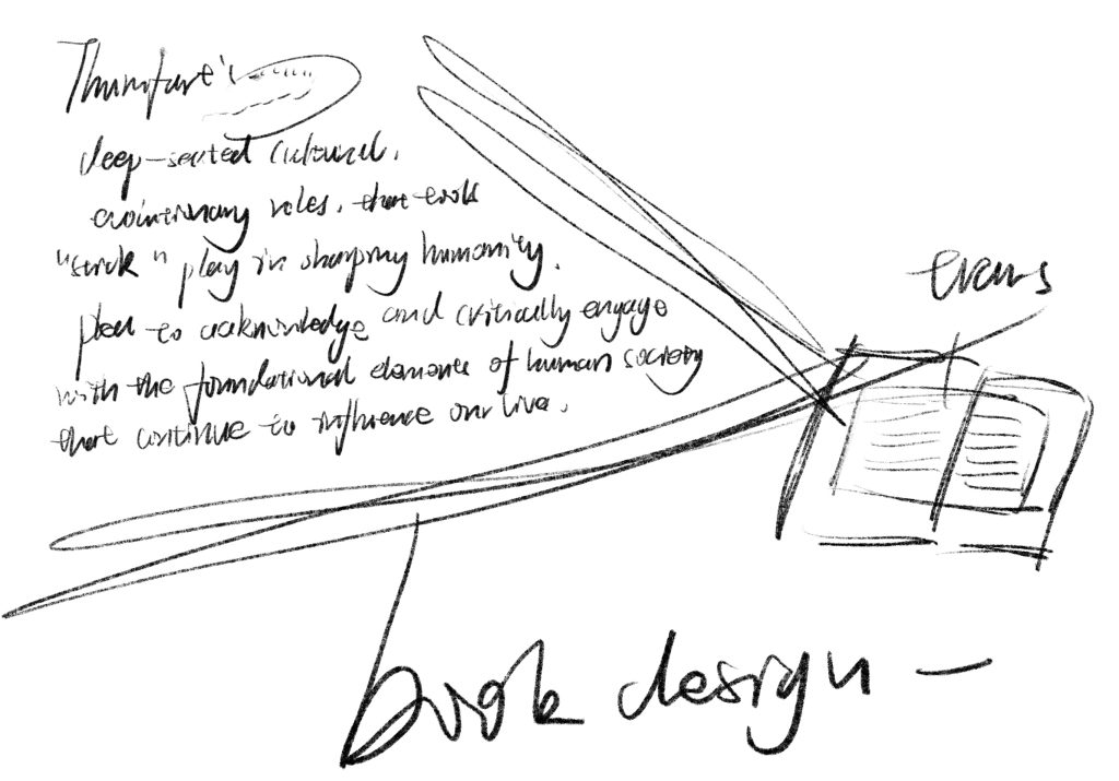
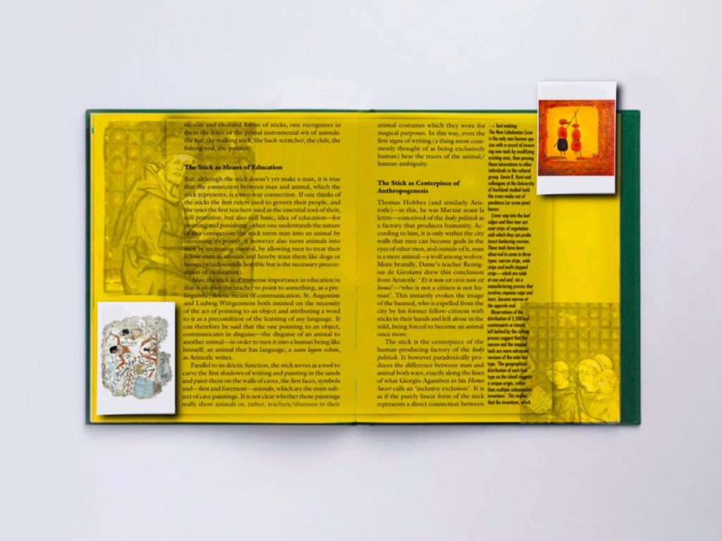
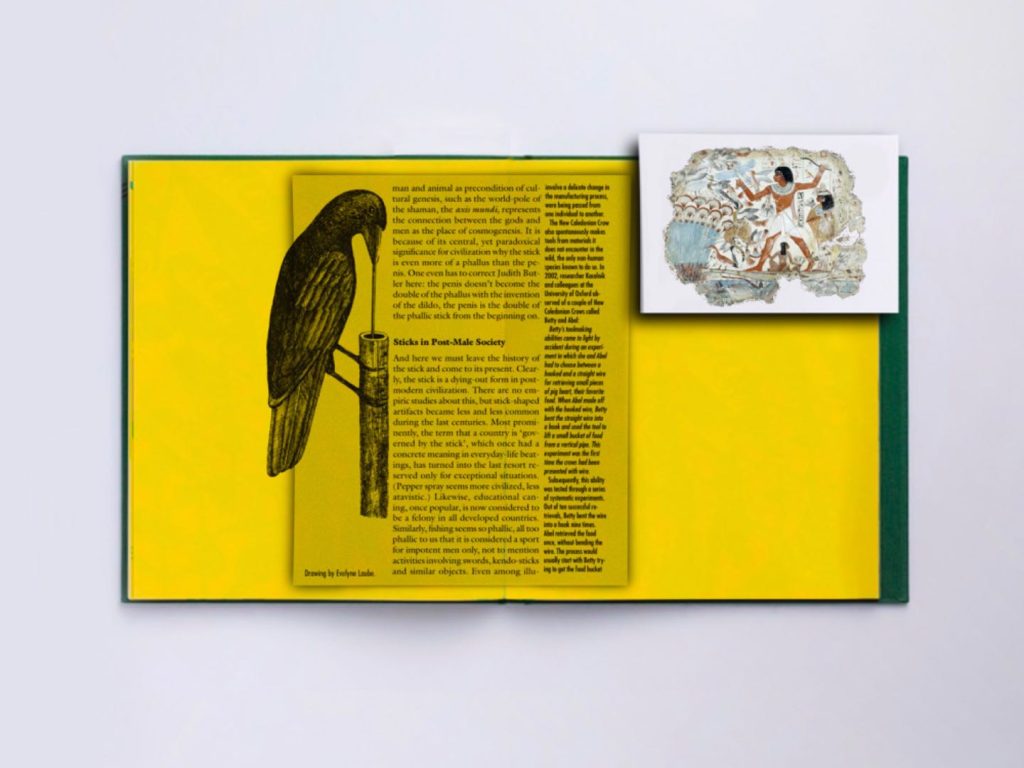
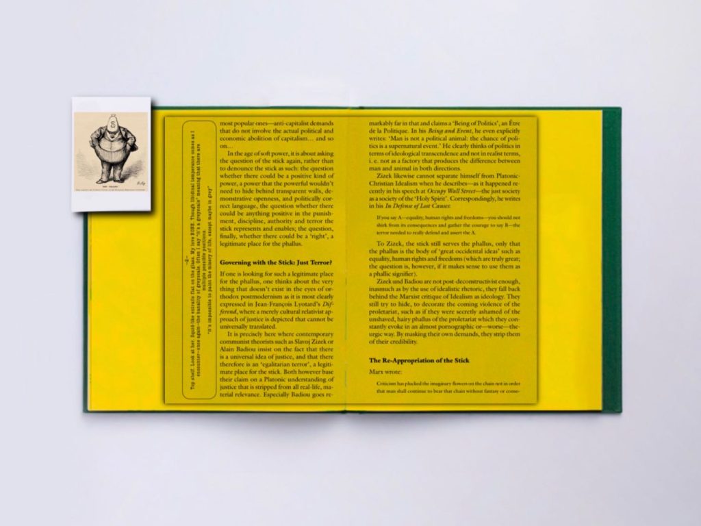
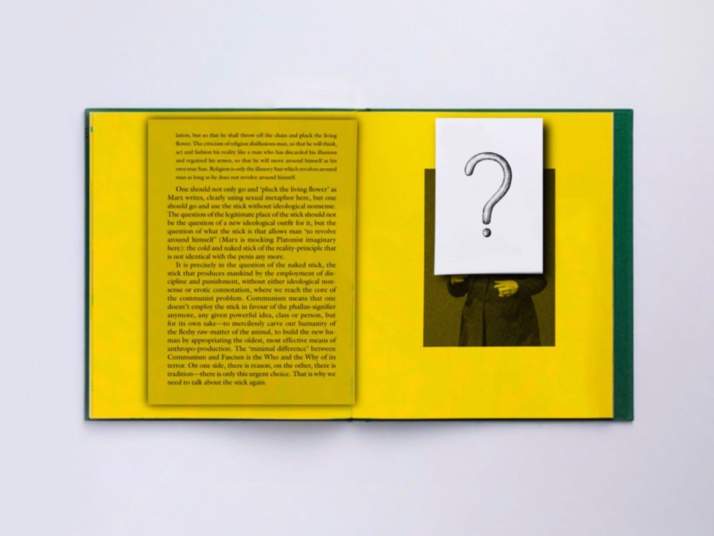
For each page I have included various illustrations and drawings that add a visual narrative to the text content.Illustrations are closely integrated with the text, sometimes superimposed on top of each other, intended to create a dialogue between the visual and the written.
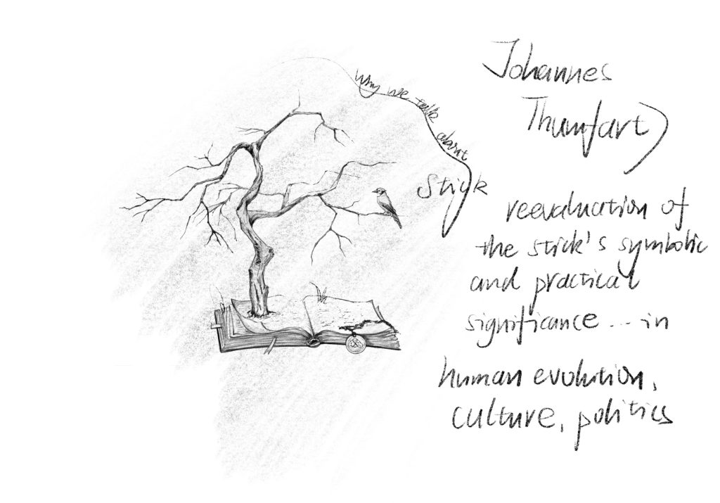
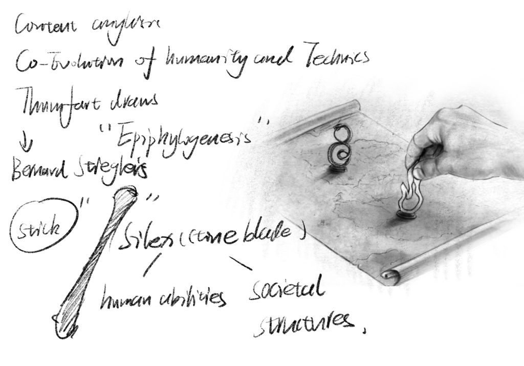
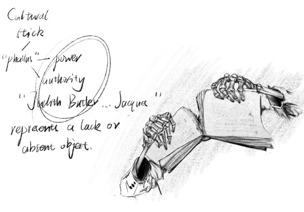
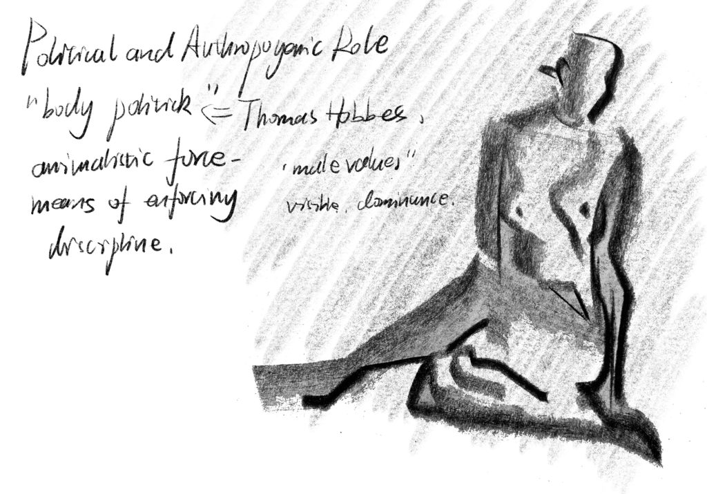
The artworks range from historical images to abstract designs, supporting my exploration of the theme of the Stick in different contexts.I have included marginal notes and mini-cards in the book to add layers of meaning and encourage the reader to engage more deeply with the text.
These inserts often contain additional images or references, creating a dynamic reading experience.The text is arranged in blocks with just the right amount of white space to prevent the page from appearing too cluttered.
In particular, I have highlighted important introductions and paragraphs to draw the reader’s attention to key arguments or turning points.
The design elements are not just decorative, they are carefully chosen by me to reflect and enhance the themes of the book. For example, the juxtaposition of different styles of illustrations symbolizes the multifaceted nature of the discussion of the “stick.”
I designed the dynamic page-turning effect, which will be presented in the video.